Our New Website: Being “Responsive”
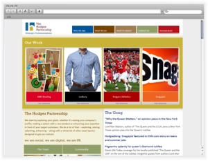
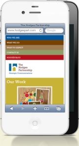
Editor's note: Great job by Tony Scida and Casey Ferguson on our new website. One of the features that's explained below is "responsive design" which basically means the site grows and shrinks to accommodate the computer or mobile device that you're using. To best illustrate, view the site on your laptop and then your smart phone. Or just look at the images below. Cool, huh? We think so. Enjoy.-JN
When I started at Hodges, the first thing I wanted to do was update the website. While the site had served the agency well for a number of years, it had started to show its age—it didn’t take advantage of the new variety of screen sizes that users have come to find on their desks and in their hands, for instance. It was also not all that easy to update to add new Hodgers or update or add case studies, for instance.
I was cautious at first, because I wasn’t sure how Jon & Josh (and my coworkers) felt about the existing site and the prospect of undertaking a major site redesign. Fortunately for me, everyone around here was in agreement that we needed a new site.
This week—just days shy of my three-year anniversary—we’ve launched the new hodgespart.com. What took so long? Well, I’ll talk about some of the site features and considerations below, but the main reason is that, as with any agency, client work comes first.
Goals for the new THP site:
- Update the look and feel to match recent logo and color palette changes.
- Better integrate additional services and practices such as social media and luxury.
- Improve updateability of the content.
- Provide a first-class experience for users of mobile and other small-screen devices.
- Put the work front and center.
With these goals in mind, we worked with Sonali and the Hodges Digital Strategies team to create the final site you see. Here are some of the features we’re particularly proud of.

Responsive Web Design
The site was designed from the start to work well on iPhones and other mobile devices. Without getting too technical, the site uses modern CSS and HTML features such as media queries to resize and shift elements on the page to provide a better experience on small devices without sacrificing the desktop experience. We learned a lot of responsive design throughout this process, as we do with every project, and we already have some enhancements to the responsiveness planned.
Client Success Front and Center
 On the previous site, the case studies were a little minimized. They were all on the same page and there was no room for compelling images. With the new site, we decided to put the case studies right up front. And, thanks to our content management system (CMS), we can easily change and update the case studies that are featured on the homepage. But case studies aren’t the only way we’re featuring client work. Because this blog serves both THP and HDS, it didn’t make sense to create a separate blog on the THP site, so instead we created what we call The Gong, a nod to the real-life gong we hang in our office. When something good happens, like a great hit for a client, we bang the gong so everyone in the office can hear. With The Gong, which I like to call our “hit blog,” we can now sound a virtual gong as well.
What’s Next?
Just because this site is launched doesn’t mean it’s done. This was a long time coming, but it’s just the starting point. We’ll continue to update the content, optimize performance, refine the responsiveness and, we hope, constantly update The Gong with quality client hits.
Leave a Reply