Good writing goes beyond the words – format and details matter

Content creation isn’t just about formulating the right words and cadence to capture your audience’s attention. It’s about formatting your content and setting expectations for what your audience is about to read.
We at Hodges consume media for a living, and we’ve seen some stellar examples (and not-so stellar examples) of how organizations can create an enjoyable experience for its readers. Now that we’re living in the days of 140 characters (and sometimes 280), it’s up to content creators to not only write content based on our audience’s preferences, but to also organize it so all readers can enjoy it.
Many outlets give you the number of minutes it takes to read an article, which we’ve included below, but we found a few other format and design features that help take the user experience to another level.
Choose your adventure
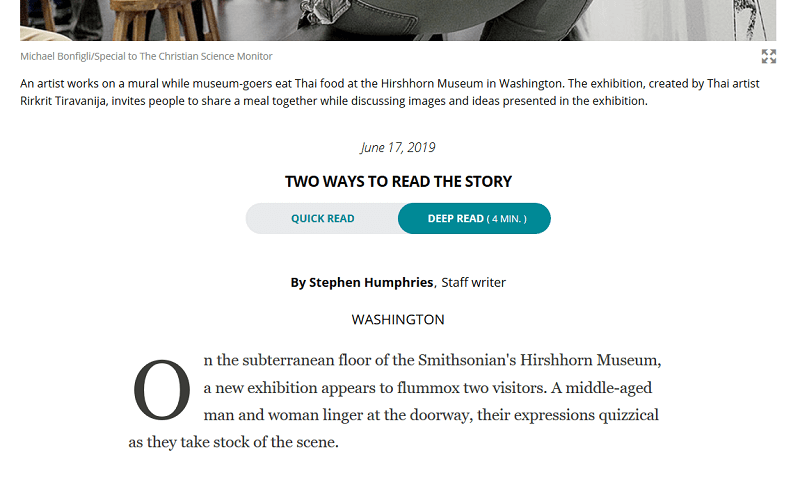
The Christian Science Monitor has a toggle feature just under the headline that offers readers two versions of the following article. By default, “Deep Read” is selected and there will be a minute count to help you make your decision on whether or not to toggle to “Quick Read.” What we like about the quick read feature isn’t just the first paragraph or bullet points, it’s the abstract version of the full article.
Category: Long read
When you’re a short-form outlet (like Buzzfeed), it’s important to set expectations with your reader when they see the headline. They may be expecting that they are clicking on a “listicle” article but instead get a 2,000-word article. A website with good UX sets the expectation of long-form content, including Fast Company and The New York Times.
Tweetable takeaways
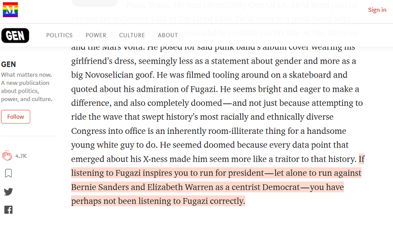
In the world of TL;DR and Tweetable quotes, sometimes you just want to scan an article to get that one golden nugget beyond the headline rather than read the full thing. We appreciate the highlight feature on Medium that lets you see the portions of that article that have been resonating most with readers.
You are here *
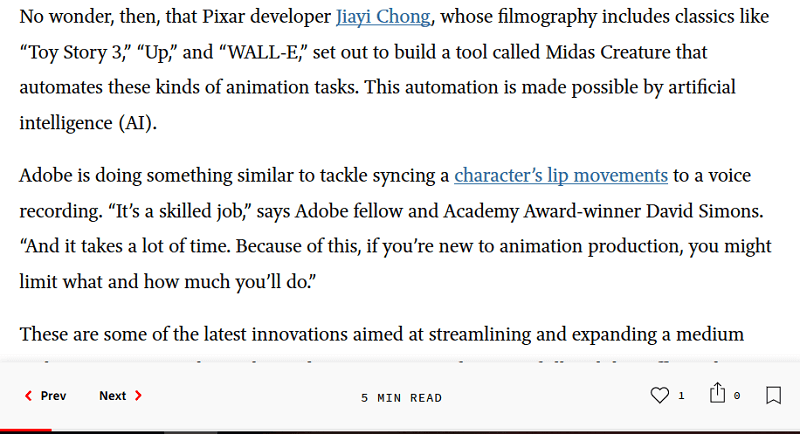
Sometimes we start reading an article only to find out the article scrolls and scrolls and scrolls and 30 minutes later we are still reading. Another example of good UX can be found on Adobe’s blog, which not only has a minute counter for how long the article will take to read, but there is a progress tracker that shows you exactly where you are in the article.
A digitally immersive experience
Content is the name of the game, right? Particularly when it comes to long-form content, and content that lends itself to a plethora of visuals, having interactive content can take the user experience to the upteenth level. The New York Times is the golden child for this kind of parallax driven, digitally immersive experience. Moving images, video integration, charts and graphics – this is the kind of article you have up on your screen and come back to multiple times to see what you missed.
This perspective is wholly from the desktop user experience, which is how I experience most of my content. What other examples of good user experience have you found as you digest content throughout the day? What kind of mobile experiences have you found to be successful? Drop me a line and share your thoughts.
Casey Prentice
A self-proclaimed organizational junkie and data geek who confesses to a secret desire to be a professional organizer, Casey enjoys account management, writing, editing and digital content strategy. Her agency work has helped clients like Virginia’s Community Colleges, VCU, ODU and Virginia DMV.
Leave a Reply