A ‘different’ Hodges…the brand.
True confession. We bought our original “h” logo for about a hundred bucks.
Neither Josh nor I can remember who designed it, but we think it was the boyfriend of someone we knew. We do remember that he handed it to us on a floppy disk though a car window in downtown Richmond.
Thanks to Tony Scida, the colors of the logo changed over the years from blue on blue to adopting the greens, yellows and blues that ZZ Top-bearded Chris McCray used to design our Shockoe Bottom offices.
As we moved away from the colors that defined our old space, the office move to Scott’s Addition was the perfect time to explore something new as the second pillar or our three-phased “remake.”
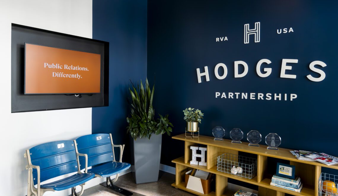
Our creative team, led by Aidan Newbold and Jada Carpenter, teamed up with our friends at Campfire & Co. to explore our new brand direction. Our discovery phase (“want to haves”) went something like this:
- Explore new colors that would complement those in the new offices
- Pay homage to our “baseball” heritage (we did name our company after the manager of the ’69 Mets, after all), but don’t make that the focus
And with that, we were still open to something completely different. Once again, Campfire’s process was exactly what we were looking for, giving us some initial mood boards, themes and colors for reaction.
For those who are considering going through this process, here are some things we learned.
- Embrace the process: We went through three rounds.
- Don’t expect to fall in love at first sight.
- Include different voices in the process and don’t expect immediate consensus.
- Communicate clearly and don’t be afraid to give good feedback as this will be the only way to reach the finish line.
- It’s OK to mix and match. Each round, we were presented with a few directions. Our final brand has elements of more than one direction we were presented.
We love our new brand that focuses more on the word “HODGES” which is what most folks know us as (I can’t tell you how many times Josh and I have been called “Mr. Hodges” over the years).
Don’t worry, “Partnership” is still part of our name as is our philosophy with our clients and agency collaborators. That will never change.
It was also important for our font and colors to be forward looking reflecting our dynamic and different approach to public relations, while at the same time maintaining a classic feel. We think we accomplished that but will let you be the judge as we roll out the new look.
But the look was just one piece of the final puzzle. We still had to decide what we wanted to be moving forward.
Next, the reflection…
Jon Newman
In 2002 Jon cofounded The Hodges Partnership and has helped to grow it into one of the country’s largest public relations firms (based on O’Dwyer’s annual rankings). Jon has taught communications as an adjunct professor at VCU, speaks regularly at conferences and meetings and blogs and tweets about public relations and marketing issues.
Leave a Reply